UI Revamp Project: Path To Deliver Modern Default UI For CKAN
The UI Revamp progress update based on the work done in 2024. It was initiated as part of CKAN 3.0 release efforts to modernize CKAN's out-of-the-box user interface. Led by Alex Gostev as project manager, the team brought together designers and developers from across the global CKAN community to create a more modern, accessible, and user-friendly interface while maintaining CKAN's core functionality.
This article provides a progress update on the ongoing UI Revamp project for CKAN 3.0. While the project is still in active development, we want to share the significant progress made so far and give the CKAN community insight into what's ahead. The final implementation details and timeline may evolve as we move toward completion.
The UI Revamp project was initiated as part of CKAN 3.0 release efforts to modernize CKAN's out-of-the-box user interface. Led by Alex Gostev as project manager, the team brought together designers and developers from across the global CKAN community to create a more modern, accessible, and user-friendly interface while maintaining CKAN's core functionality.
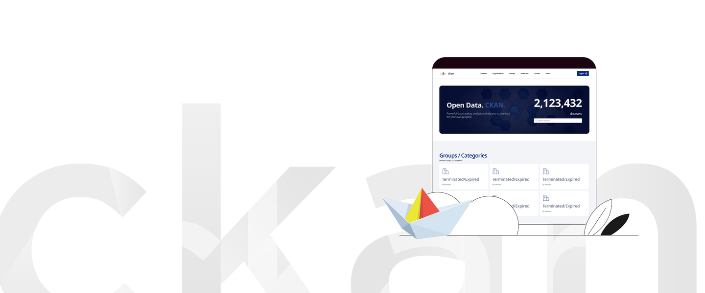
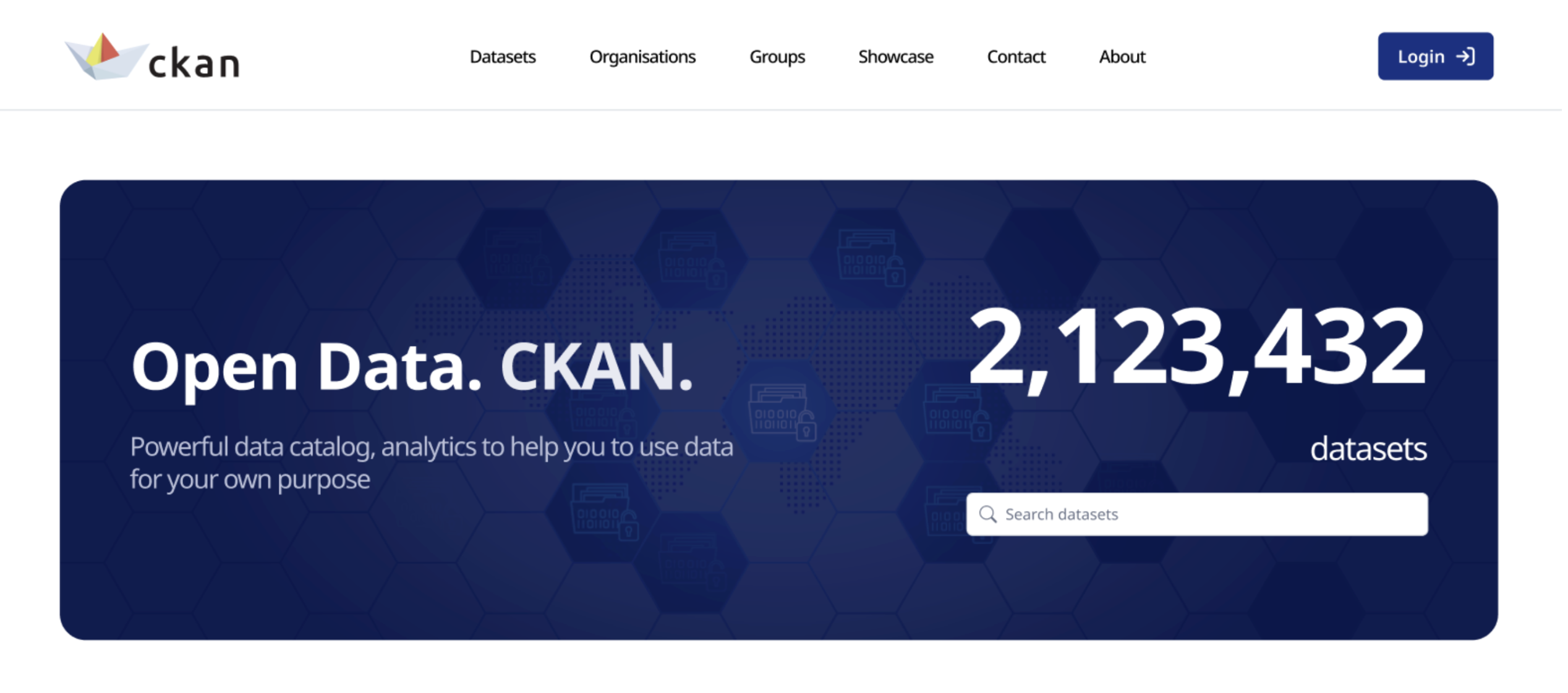
New design created by UI Revamp team
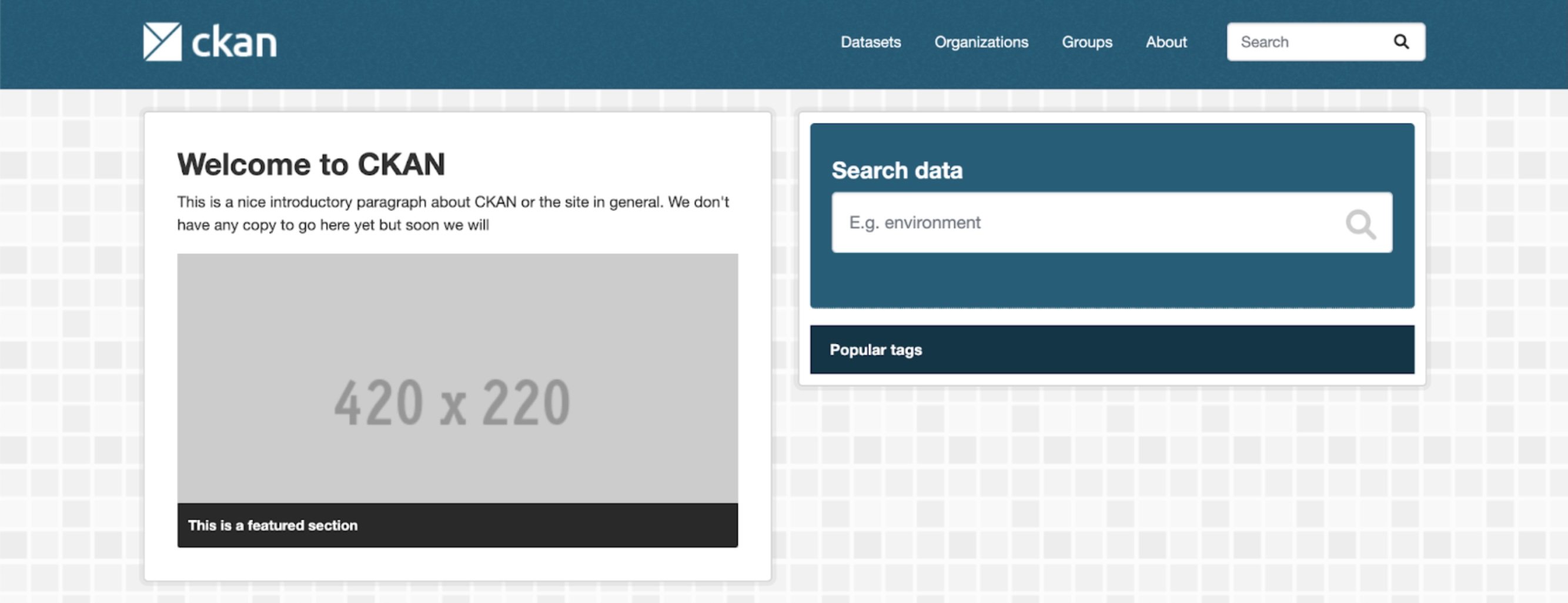
Design that served CKAN well for last 17 years
The Team
Petar Gligorovski - Lead Designer,
focuses on developing CKAN's new visual language.
Eucharia Odili - Designer,
works on delivering layouts and components.
Alex Green - Lead Developer,
focuses on HTMX implementation and frontend development.
Stephen Oni - Developer,
joined later in the project, contributing to UI implementation.
Alex Gostev - Product Manager,
initiated the project, formed the team, and is driving it to completion.
More about each team member you can read at the end of the article.
Why a New UI is a Big Deal
The UI Revamp project is a major update to CKAN's visuals and user experience. It aims to provide a modern, clean interface out-of-the-box.
Additional benefits are:
Improved accessibility
Better mobile support
Faster performance through HTMX
More consistent user experience
The Challenge of Legacy UI
Many organizations that use CKAN for their data portals face a significant challenge: they lack the in-house development resources to create and maintain a modern, user-friendly interface. The default CKAN interface, while functional, has historically required substantial customization to meet modern user experience standards. This creates a barrier for:
Small government agencies
NGOs and non-profits
Research institutions
Municipal data portals
Organizations in developing countries
The new UI is more than a visual upgrade. It's an investment in making data management tools accessible to all. CKAN has a professional and modern interface by default. It helps organizations of any size fulfill the open data requirements. This matches CKAN's mission. It aims to make data management easy. It also wants to ensure that limited resources don't stop organizations from providing high-quality data portals to their communities.
This helps smaller organizations in developing regions. They can now maintain high-standard data portals without needing much tech support. It is a key step to making open data accessible to all, regardless of their tech skills or resources.
The new UI provides significant economic advantages of reduced initial costs and lower maintenance costs:
No need for custom theme development
Immediate professional appearance
Lower setup complexity
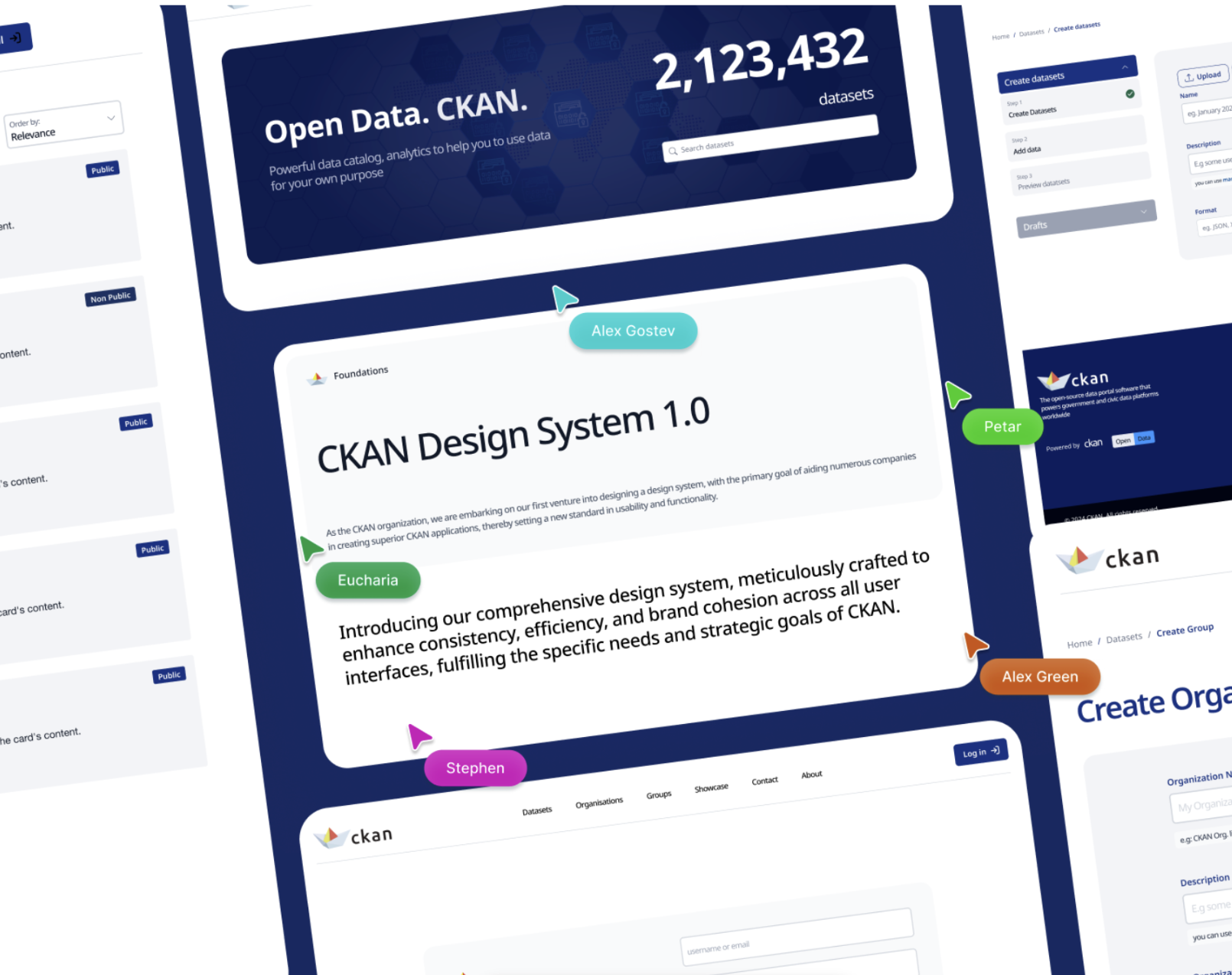
Design System 1.0
Design system for CKAN openly available
The CKAN Design System represents our vision for how data portals should look and feel in the modern era. It's not just a collection of UI elements, but rather a living document of our design philosophy and principles that will evolve alongside user needs and design trends.
The catalog is built on three foundational ideas:
Clarity Over Complexity
Data interfaces should reveal information progressively, avoiding cognitive overload while maintaining depth.
Universal Access
Design patterns must work across cultures, devices, and abilities. Our royal blue primary color (#193164) was chosen specifically for its cultural neutrality and accessibility.
Purposeful Evolution
Every design element should have a clear intent. We continuously evaluate and refine patterns based on real user feedback.
Our visual language combines:
Clean typographic hierarchies that guide users through information
Thoughtful white space that gives data room to breathe
Organizations can adopt the design system through:
Direct implementation - using default components out-of-the-box
Customization - extend or update components while maintaining consistency
The design system is maintained in Figma, providing detailed specifications and usage guidelines for each component. This ensures teams can implement features correctly while maintaining the intended user experience.
Flexibility is the core feature of the design system. It allows organizations to extend the system while maintaining consistency. The design system establishes core patterns that can be customized without breaking fundamental usability principles. Color schemes can shift while preserving accessibility. Layouts can adapt while maintaining familiar navigation patterns. New components can be added that follow established design language.
Project Timeline
Project Initiation - December 2023
Initial team assembly and scope definition
Agreement on reward structure with CKAN co-stewards
Although work is contribution-first and is a goodwill of contributors
Establishment of project management framework
January-February 2024
Project kickoff
Initial work on design system fundamentals
Setup of a collaborative environment using Figma and Slack
Beginning of component design work
March-April 2024
Delivery of basic UI components including
Completion of core design system components
Implementation of the first components by the development team
Integration of HTMX functionality
May-June 2024
Mobile design implementation
Completion of layouts designs
Design system documentation
Start of frontend implementation
Color scheme refinement through community feedback
July-August 2024
Development of mobile-responsive layouts
Integration with CKAN core started
Implementation of accessibility updates (100+ small fixes related to contrast, button sizes, and fonts)
The team worked on implementing designs with a focus on resource creation workflow, which was recently updated to align with CKAN 2.11 release changes. Mobile responsiveness testing and accessibility improvements are ongoing priorities.
December 2024
4 of 10 layouts are in the PR + deployed stage. The same goes for 50% of the components.
January-February 2025
The plan is to:
Finalize UI implementation
Refactor layout designs
March 2025
Target timeframe for release, pending final testing and community review.
Exact timing may adjust based on development progress and integration requirements.
Meet the Team Members
UI Revamp team members are listed in the order of joining the team.
Alexander Gostev
Product Manager, CKAN Contributor, Open Data Contributor.
What made you decide to join the redesign of CKAN's UI?
The story starts with CKAN Stakeholders Research that I conducted from May to September 2022. There were 37 interviews with professionals who are using, maintaining, and developing CKAN-based data portals and driving CKAN forward as a vehicle for open data publishing (shout out to the co-stewardsDatopian and Link Digital and the core dev team). By compiling the answers, 19 directions for further improvements of CKAN were identified.
Then within the CKAN community, we mapped hypotheses derived from the research to solutions to ensure that every opinion is heard and we’re using all the available expertise. You can check these discussions on the board in ckan/ckan repository in GitHub. Consensus-driven approach led to the forming of a joint agreement on the need for a UI update.
Then it was agreed upon with co-stewards to form a bonus pool for contributors to the initiative, which led to public call for contribution and the formation of the UI Revamp project team.
What challenges did you face during the redesign process?
I’m happy to state that we went through all the challenges and delivered the result. A good end of the story is important. However, along the way, we had a few bigger and smaller problems to solve and roadblocks to bypass, for example:
At the start, no one was sure if it was possible to form a team of contributors that would be cohesive enough to deliver consistently from 0 to 1.
During the design stage, we decided to perform an automated audit for web accessibility to get the end design closer to meeting Web Content Accessibility Guidelines (WCAG) 2.2. The audit led to the creation of 100+ small updates to be made which weren’t initially accounted.
During the implementation stage, CKAN 2.11 release led to changes in dataset creation workflow that led to retrospective changes in designs and implementation.
UI Revamp is a project with ~1 year timeline and a global impact so we as a team expected to encounter some changes along the way. The best part of these challenges is that they were successfully passed by now.
What key features do you hope CKAN users will enjoy most from this update?
The most important is the equality that the new UI brings. A large portion of active CKAN instances rely on developers with limited availability due to budget constraints. It could be: city open data portals, regional portals, or open data catalogs by smaller NGO’s. With new UI they’d be on par with the expected look and feel right out of the box. As a result, we expect more data portals launched and more open data published. Thousands of active CKAN portals can benefit from the new UI after the update to the latest version of CKAN.
Alex Green
Lead Software Developer, CKAN Contributor, Open Data Contributor.
What made you decide to join the redesign of CKAN's UI?
I decided to help out with the redesign of CKAN's UI after working with CKAN's interface for a year. Every day, I would log in to work to modernize CKAN for the needs of my organization and I appreciated the opportunity to do so, on a wider scale, for CKAN itself. I saw all that CKAN can do but I was distracted by how clunky it appeared.
What challenges did you face during the redesign process?
During the redesign, I found myself running into the issue of opting for icons within the icon library that didn't convey the same look that the designers were going for with the use of a particular SVG, so having to make the decision if the look the SVG achieves is worth keeping or if it's necessary at all. I think the sentiment applies to other areas of the redesign as well, such as opting to preserve the look of the design while working within the borders of CKAN and having to decide whether the proposed look is worth disturbing the CKAN norm.
What key features do you hope CKAN users will enjoy most from this update?
I hope users will enjoy the dataset facets being collapsible accordions. It's a small feature but feels like it can be really convenient and user-friendly. I'm excited about it all, really, the modern look, the new colour, the new experience. I'm just excited to share it all with the community and hopefully be able to hear their feedback!
Petar Gligorovski
Lead UI/UX Designer, CKAN Contributor.
What made you decide to join the redesign of CKAN's UI?
My decision to join the redesign of CKAN's UI was driven by my passion for creating seamless user experiences that bridge complex data with intuitive interfaces. CKAN, as a powerful data management platform, plays a crucial role in enabling access to open data, which aligns with my core values of transparency and usability. With over 20 years of experience in UI/UX design and web development, I saw the redesign as an exciting opportunity to apply my skills in simplifying user journeys, optimizing usability, and improving the overall aesthetic of the platform. I'm eager to help create a modern, user-centered design that not only enhances functionality but also aligns with CKAN’s mission to make data accessible to a wider audience.
What challenges did you face during the redesign process?
One of the main challenges I faced during the CKAN UI redesign process was balancing the platform's extensive feature set with a clean, intuitive interface. CKAN is used by a wide range of users with varying levels of technical expertise, so it was crucial to create a design that catered to both novice and expert users. Another challenge was optimizing the UI for better data visualization while ensuring that performance remained smooth across different devices and platforms.
Before diving into the redesign, I had the advantage of reviewing CKAN with colleagues who were already working on the application, which gave me a solid understanding of both the complex back-end and front-end architecture. This early exposure allowed me to quickly grasp the system's intricacies and identify areas that could benefit from a more seamless design integration.
One of the main challenges was aligning the front-end design with CKAN’s sophisticated back-end functionalities. Ensuring that the UI enhancements did not disrupt the platform's core technical features required close collaboration with the development team. By leveraging user-centered design principles, I focused on maintaining a balance between usability and functionality. This involved conducting user research, gathering insights from diverse stakeholders, and iterating on designs to ensure the end result not only improved the user experience but also seamlessly integrated with the technical framework.
What key features do you hope CKAN users will enjoy most from this update?
As part of the CKAN community, I’m excited to contribute not only to this redesign but also to the platform’s ongoing development. One of the key features I believe users will enjoy most from this update is the improved usability and streamlined navigation. By refining the user interface, we’ve made it easier for users to find and interact with data, whether they’re newcomers or experienced professionals.
I'm especially proud of the enhancements in the user interface, where careful attention was given to color psychology, typography, and overall layout to create a more engaging and aesthetically pleasing experience. These changes make the platform more user-friendly, reducing cognitive load and improving the flow of information. The redesigned application now offers a cleaner, more organized structure, enabling users to access datasets more efficiently, which will ultimately enhance productivity.
This feature allows for deeper insights without requiring advanced technical expertise, making CKAN more accessible to a broader audience. The redesigned dashboard is another highlight, offering a cleaner, more organized way to access datasets, ultimately boosting user productivity.
Additionally, the responsive design ensures a seamless experience across all devices—whether on desktop, tablet, or mobile—so users can interact with CKAN anytime, anywhere. We’ve also made significant improvements to accessibility, following WCAG standards to ensure the platform is inclusive for users with varying abilities.
I’m committed to staying involved in CKAN’s evolution, and I look forward to collaborating with the community to continue enhancing the platform's functionality and user experience for the long term.
Overall, I’m excited about the opportunity to continue contributing as Lead UI/UX Designer to CKAN, not just for version 3.0, but for future iterations as well.
I look forward to collaborating long-term, driving innovation, enhancing design, and improving usability in future versions of CKAN, ensuring the platform evolves to meet the needs of its users and stays at the forefront of open data solutions.
Eucharia Odili
UI/UX Designer, CKAN Contributor.
What made you decide to join the redesign of CKAN's UI?
I joined the CKAN UI redesign because I wanted to help create a more intuitive and accessible experience for users. As a designer, I understand the critical role user-friendly interfaces play in making open-source tools effective and inclusive. CKAN’s mission to make data more accessible aligns closely with my own values, and I felt this redesign offered a great opportunity to contribute my skills to a project that has a meaningful impact on data accessibility and transparency.
What challenges did you face during the redesign process?
One of the main challenges was balancing the functional needs of diverse user groups with an updated and streamlined design. CKAN is used by a variety of organizations, so the UI needed to be both adaptable and intuitive without compromising any core functionalities. Ensuring a smooth transition for existing users while introducing the new design was also a priority.
What key features do you hope CKAN users will enjoy most from this update?
I hope users will enjoy the fresh, modernized look of the interface, which makes the platform more approachable and visually engaging. We've also introduced features that make navigation smoother and help users find the tools and datasets they need more efficiently. The design enhancements aim to provide a cohesive experience across all screens, making it easier to explore, analyze, and manage data with minimal friction. I’m especially excited about the user feedback on the accessibility improvements, which are intended to make CKAN a more inclusive platform for everyone.
Overall, contributing to CKAN’s UI redesign has been a fulfilling experience. Working on a project that empowers organizations to make data more accessible has not only helped me grow as a designer but has also given me the chance to collaborate within a passionate open-source community. I'm looking forward to seeing how the updated design supports CKAN users in achieving their goals more efficiently and helps make data resources more usable and impactful for everyone.
Stephen Oni
Software Developer, CKAN Contributor.
What made you decide to join the redesign of CKAN's UI?
My involvement in the CKAN UI redesign came as a natural extension of my previous contributions to the project. Having worked with CKAN’s interface before, I saw opportunities to improve its usability and modernize its presentation. When the opportunity arose to contribute to the UI revamp, I was eager to apply my technical expertise to help enhance the user experience. The project’s impact on thousands of open data portals made it an exciting challenge to be part of.
What challenges did you face during the redesign process?
One of the key challenges I faced was working with evolving design specifications. Some UI components were still being finalized while development was already underway, requiring frequent adjustments and iterations.
What key features do you hope CKAN users will enjoy most from this update?
One of the most noticeable improvements is the cleaner, more spacious layout, making navigation more intuitive and less overwhelming. The updated UI declutters the interface while preserving CKAN’s robust functionality, making it easier for users to explore datasets and manage content. Additionally, improved visual hierarchy enhances readability, allowing users to find the information they need more efficiently.
P.S. by Alex Gostev: Stephen came exactly at a time when we needed more steam to move the implementation at a higher pace. He did the job professionally and synched with the team regularly. It was a productive collaboration! 🤝
Discover how the Norwegian Refugee Council (NRC) is using CKAN to streamline humanitarian data management, improve collaboration, and enhance data accessibility for field teams across 40+ countries.